By Nathan McKeogh and Raquel Ortega-Argilés
As a complement to the TPI Productivity Lab’s Productivity Measurement Analysis Series and as part of the international collaboration with Martin Fleming and Klaas de Vries, the Lab has created an international quarterly productivity data tool for long-term productivity analysis.
The TPI Quarterly Data Tool is an interactive platform which allows for quick creation of informative visualisations for comparing productivity internationally. Users can compare productivity performance across countries through a series of productivity measures: Output per Hour Worked (OPH), Output per Worker (OPW) and Gross Value Added (GVA).
Developed with policy makers and researchers in mind, the tool helps to visualise trends in productivity on a global scale.
International comparisons can be challenging due to variations in data availability, formats, and methodologies used by different statistical agencies. This tool addresses that issue by providing access to a comprehensive, collated dataset of quarterly and yearly productivity data going back to 1997 and updated with each new quarterly release. The dataset contains compiled data from multiple sources, including the Office for National Statistics (ONS), the Bureau of Labor Statistics (BLS), Eurostat, and the OECD (more information on data and methodologies can be found on Figshare).
Options available in the tool
Customisation options include:
- Flexible plot formatting settings
- Option to change the base year of the data
- Visual indicators for major dips in productivity during the 2008 recession and the COVID-19 pandemic
The tool allows for selection of various countries including: the UK, US, France, Germany, Italy, Spain, Ireland, Denmark, Netherlands, Norway, Poland, Romania and Sweden. As well as the selection of aggregate data for European Union member nations and for Euro area nations.
For the quarterly data available, users can generate a variety of visualisations:
- 2D line graphs
- 3D line graphs
- Quarter-on-Quarter/Year-on-Year bar charts
- Side-by-side comparison visualisations
What can the tool show?
The tool provides the ability to break down GVA by industry, allowing users to compare trends across different sectors. This can provide a better understanding of factors influencing national economic performance. Figure 1 shows an example of the industrial comparisons available in the tool, highlighting output trends across major European nations, as well as an aggregate for the countries which use the Euro.

Figure 1: Gross Value Added across industries for major European economies (1997 = 100), Visualisation created by the TPI Quarterly Data Tool
Figure 1 presents an overview of industry growth since 1997. Beyond this long-term perspective, the tool also enables users to explore how economic output has responded to major shocks, such as the COVID-19 pandemic. Figure 2, for example, highlights the impact of the pandemic on GVA across European nations. The pandemic highlighted heterogeneity of productivity across industries. Predictably, we can see that industries that relied on in-person human activity were the most restricted during the pandemic and therefore hit the hardest. In contrast, industries which are mostly digital, or had the ability for digital adoption, faced less significant disruption (de Vries et al, 2021).
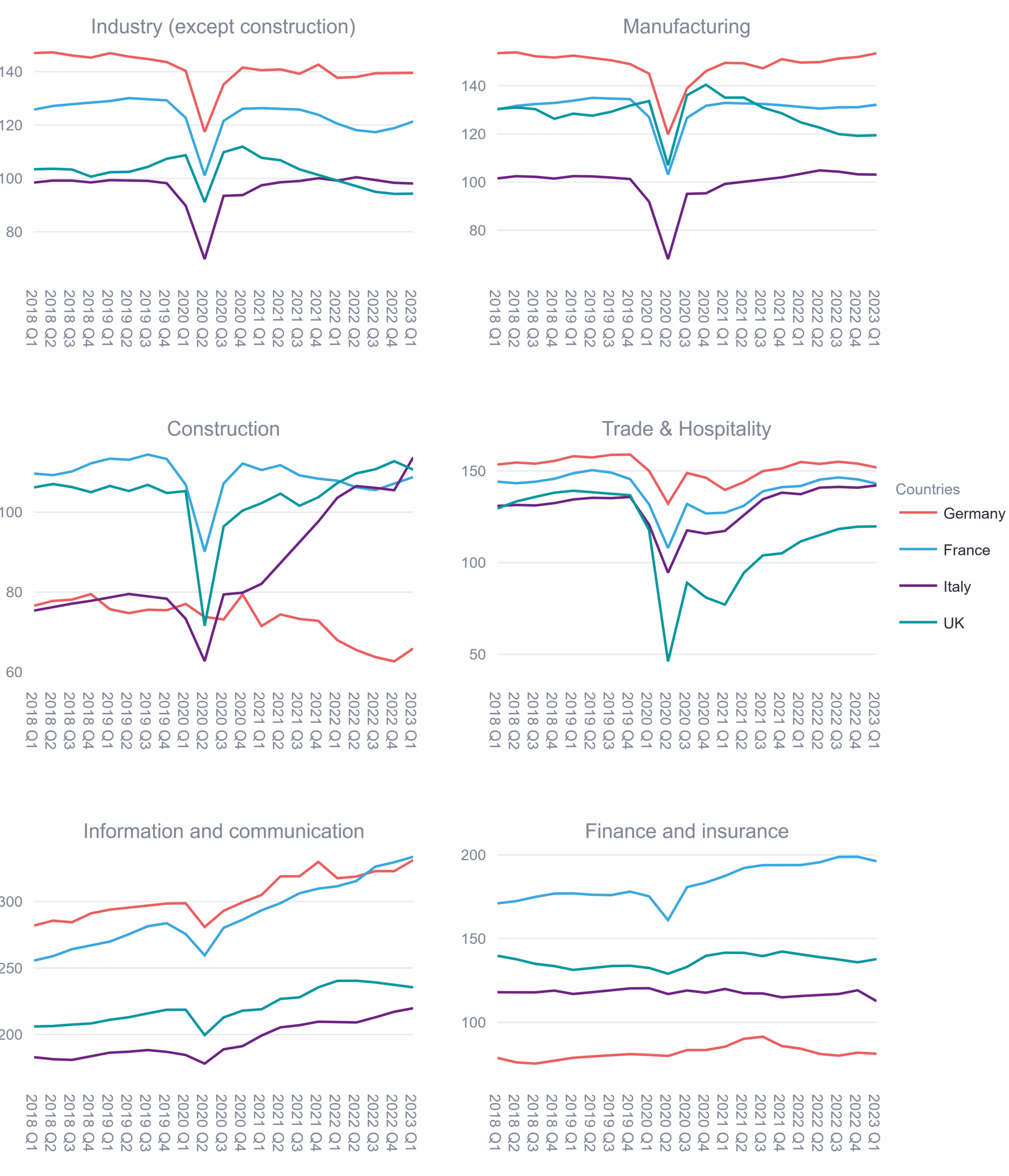
Figure 2: Gross Value Added (GVA) across industries in major European economies, 2018–2023 (1997 = 100), Visualisation created by the TPI Quarterly Data Tool
Looking even further into this data we can see that of the major economies in Europe visualised, every nation’s construction industry had a large dip in GVA during COVID, except for Germany. This was because, unlike the other nations, Germany did not stop construction projects, so any dip in productivity was not due to government policy but due to other COVID restrictions such as material supply issues and labour shortages (Gornig et al, 2021). This is shown in Figure 3.
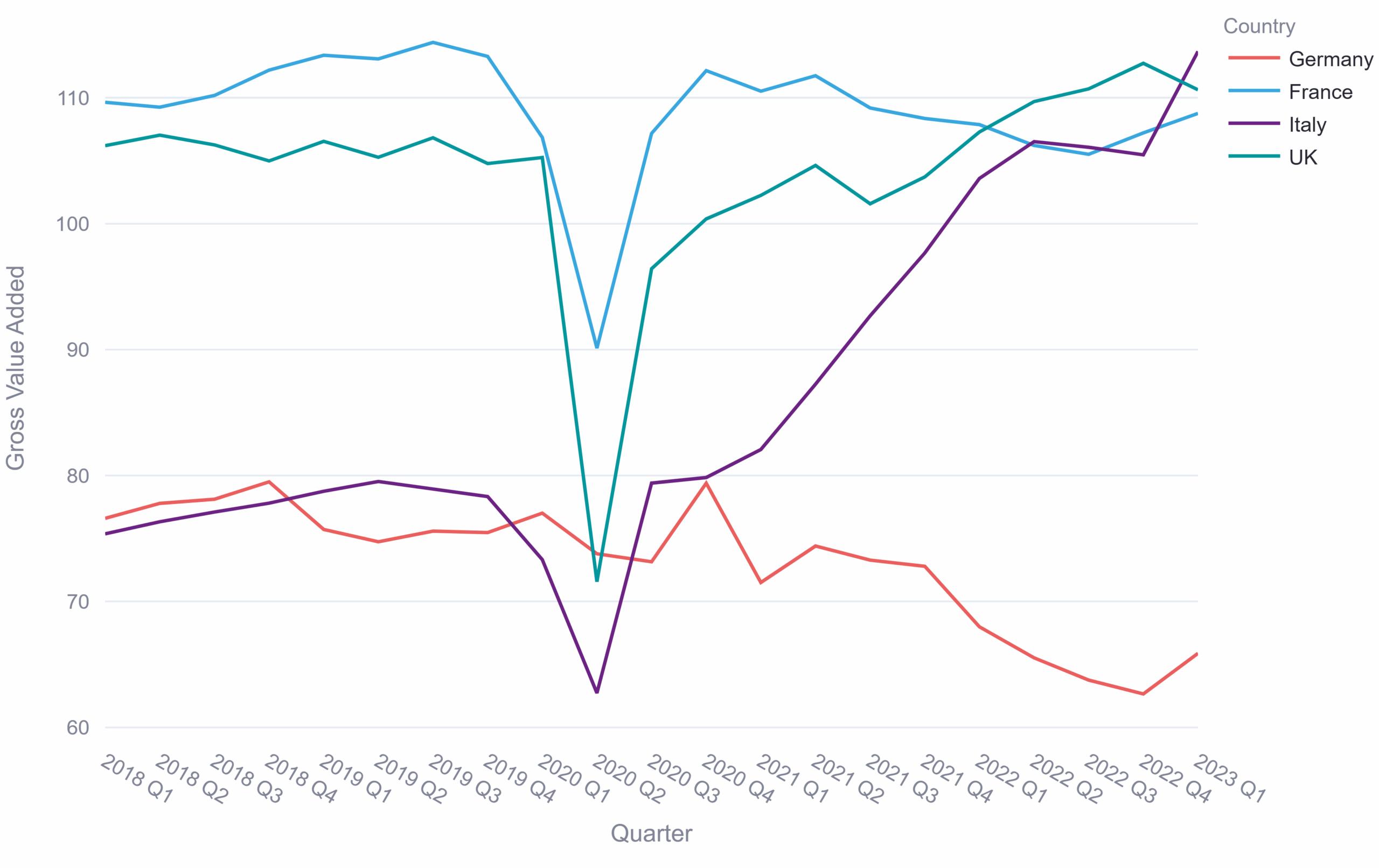
Figure 3: Gross Value Added for construction, 2018-2023 (1997 = 100), Visualisation created by the TP Quarterly Data Tool
The tool supports analysis of economic growth by enabling Quarter-on-Quarter and Year-on-Year comparisons of the measures over any selected time period. For example, the tool can be used to compare Quarter-on-Quarter growth for the US and the UK over the past decade. Figure 4 visualises this.

Figure 4: Quarter-on-Quarter comparison for Output Per Hour comparing the UK and the US, 2015-2025 (2015 = 100), Visualisation created by the TPI Quarterly Data Tool
As shown in Figure 4, COVID-19 caused sharp fluctuations that obscure underlying productivity trends. To address this, the tool supports side-by-side graphing, allowing users to compare pre- and post-COVID periods. This allows the user to create visualisations highlighting productivity growth, without the skewing effect of COVID-19. An example of this is shown in figure 5 where the pre and post-COVID periods have been visualised side-by-side.
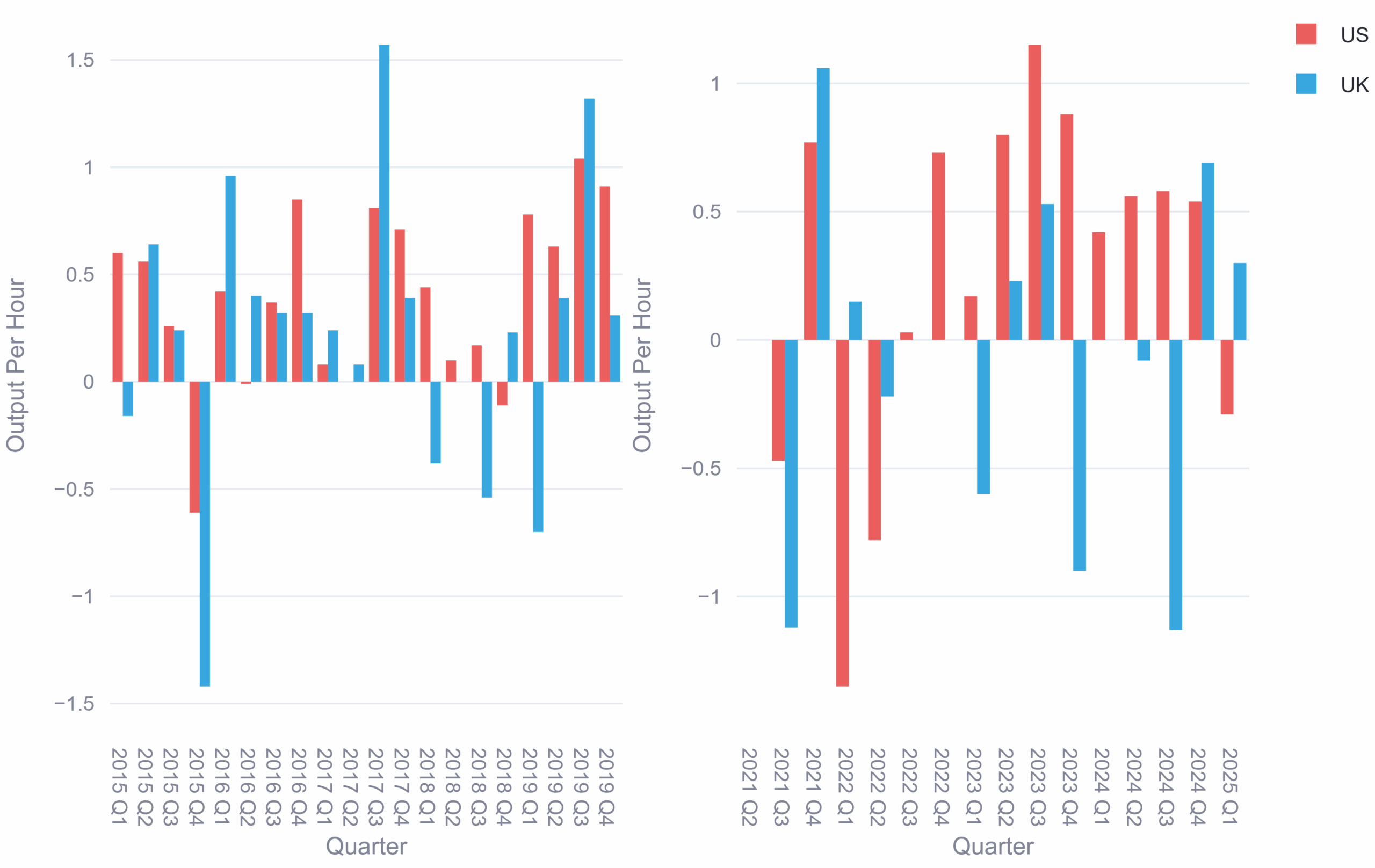
Figure 5: Quarter-on-quarter, side-by-side comparison of Output Per Hour for the UK and the US, pre- and post-COVID (2015 = 100), Visualisation created by the TPI Quarterly Data Tool
The TPI Quarterly Data Tool is available online on the TPI Productivity Lab website and updated quarterly. Whether you’re analysing long-term growth, sectoral shifts, or policy impacts, the tool offers a flexible way to explore productivity trends over time.
References
de Vries, K., Erumban, A., van Ark, B. 2021. Productivity and the Pandemic: Short-Term Disruptions and Long-Term Implications. The Productivity Institute Working Paper 007.
Gornig, M., Michelsen, C., Pagenhardt, L. 2021. German Construction Industry Remains on Its Path of Growth during the Coronavirus Recession. DIW Berlin.